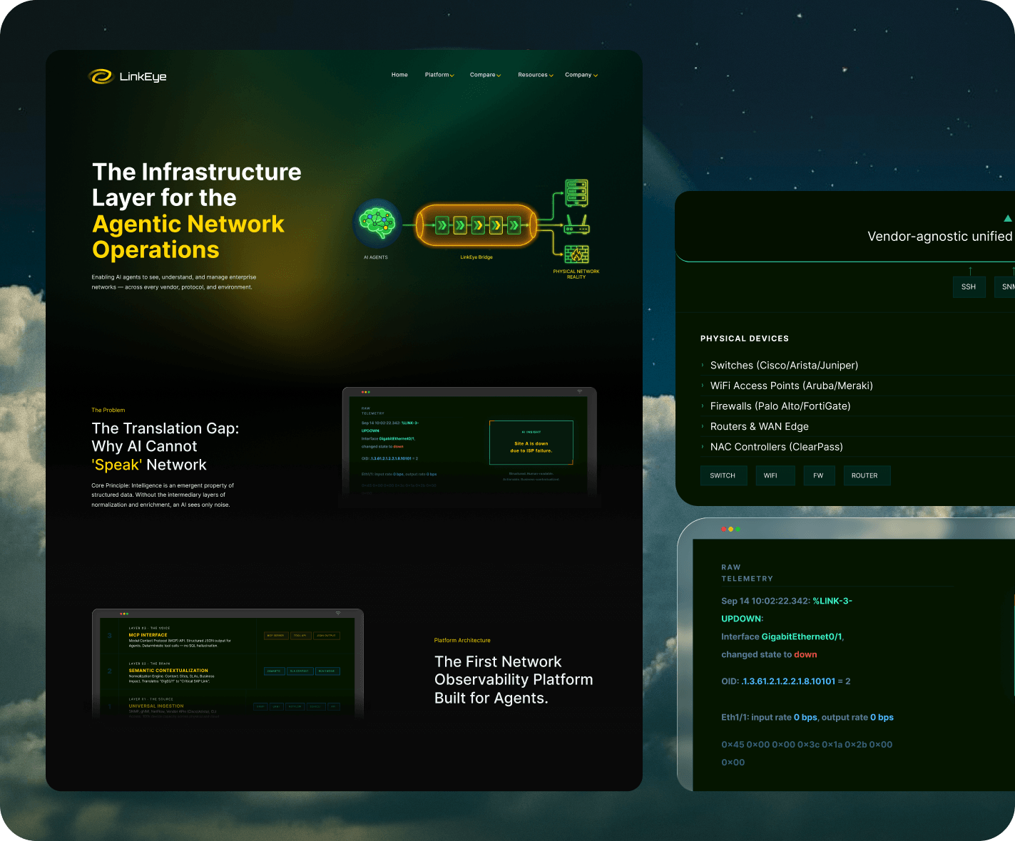
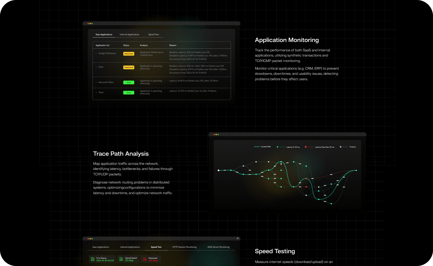
The visual foundation was established first. A dark-mode interface was not an aesthetic choice, it is the visual language of the infrastructure and DevOps tooling category. Buyers evaluating enterprise network tools arrive with a set of category expectations. The design was built to operate within those expectations while giving LinkEye a distinct identity within them. The credibility signals, SOC 2 certification, vendor integrations across Cisco, Palo Alto, AWS, Fortinet, Juniper, Arista, and others, the founding team’s institutional background, were positioned where they function as confirmation of capability rather than promotional claims.
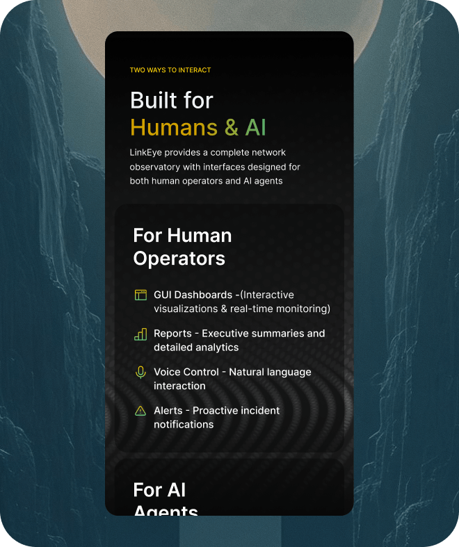
The product architecture required careful navigation design. LinkEye serves two distinct audiences with different interaction modes: human operators working through GUI dashboards, reports, voice control, and alerts; and AI agents interfacing through MCP server, REST API, and the SIAA semantic layer. The site needed to present both without collapsing the distinction between them or requiring a visitor to work out for themselves which layer was relevant to their evaluation.
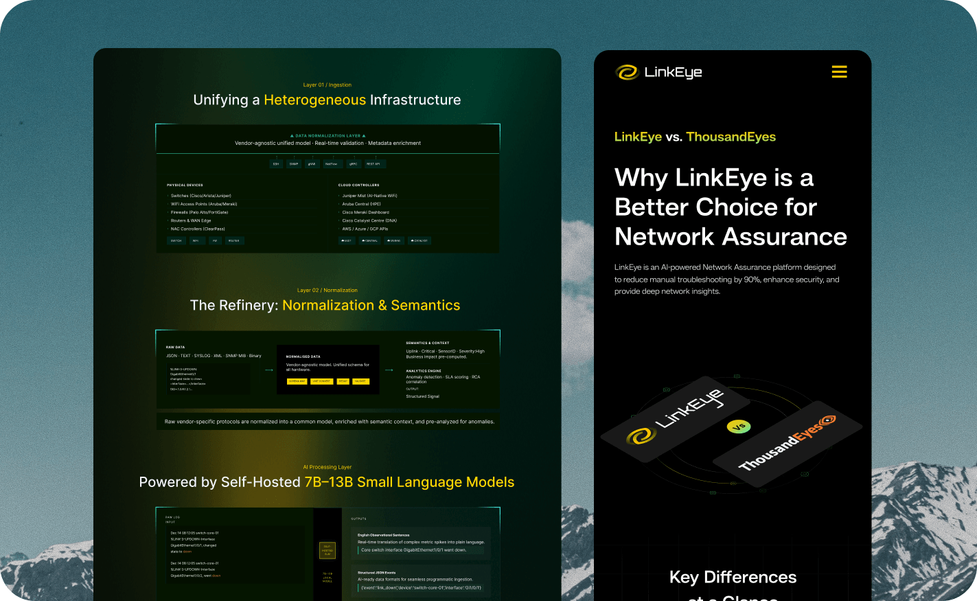
Dedicated comparison pages were built for SolarWinds, ThousandEyes, and Auvik. A buyer considering a switch from an incumbent tool needs a structured basis for that comparison. The pages were built to deliver that without requiring the visitor to construct the comparison themselves from separate product pages.
The resources section was organized to support the full evaluation arc: blog content for initial discovery, case studies for validation, downloads for technical depth. A visitor moving through that sequence should not encounter navigation that interrupts the progression. The demo conversion path, the primary lead generation mechanism, was placed at the points where a technical buyer has formed enough of a view to act, with a structured form capturing the organizational context that an enterprise sales process requires.