Web forms are a simple way to collect information from your website’s visitors. They are essential if you want to provide a great user experience. But if your web forms are not effective, they can actually turn visitors away.
In this blog post, we will discuss five of the most important best practices for designing accessible forms. We will also provide tips on how to implement these best practices in your own designs. If you want to make sure that your forms are accessible to everyone, there are a few best practices you should follow.
The Web People specializes in creating effective web forms that convert visitors into customers. We create forms that are clear, concise, and easy to use for all businesses. Check the top website design trends for 2023 to transform your website into a visually appealing and engaging platform that stands out in the digital landscape.
1. Use labels that are always visible
Users often find it difficult to understand what information is required in a web form.
Use clear and concise labels to make it clear to users what information you need from them. The best way to ensure that your labels are always visible is to position them above the input field. This creates a straight line for the user’s eyes to follow, making it easier to scan the form.
For example, if you are asking for a user’s name, you could use the label “Your name” above the input field.
2. Use clear instructions
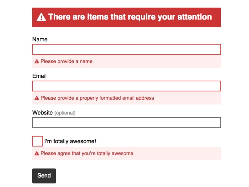
Users often encounter errors when filling out web forms.
Provide clear instructions for your users, including explaining what information is required in each field, as well as what the user should do if they encounter an error. Error messages should be clear and concise, and they should provide the user with enough information to correct the error. They should also be accompanied by relevant options, such as the ability to clear the field or start over.
For example, if a user enters an invalid email address, you could display an error message that says “Please enter a valid email address.” You could also provide the user with the option to clear the field or start over.
3. Correctly proportioned form fields
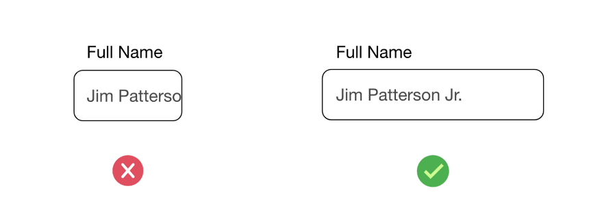
Users often find it difficult to enter information into small form fields.
The size of your form fields should be proportional to the amount of input that is expected. This will help users to understand the expected input, and it will also ensure that they can see the entire input field when they are typing.
For example, if you are asking for a user’s name, you should use a larger form field than if you are asking for a user’s email address.
4. Task-specific buttons
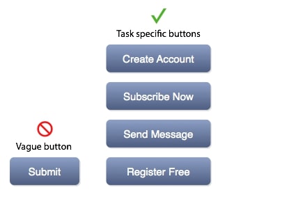
Users often find it difficult to understand what will happen when they click a button on a web form.
The buttons in your form should be task-specific. This means that the button text should clearly indicate what action will be taken when the button is clicked.
For example, if you have a button that submits the form, the button text should say something like “Submit” or “Send.”
5. Use consistent formatting
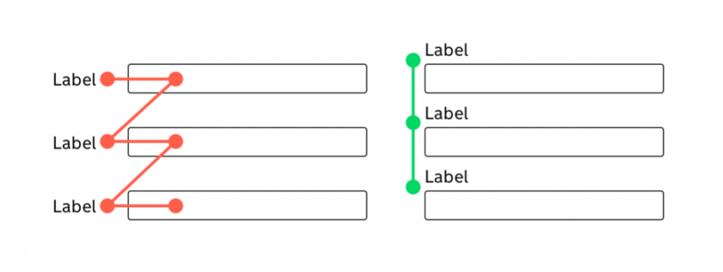
Users often find it difficult to scan a web form if the formatting is inconsistent.
The formatting of your form should be consistent throughout. This includes the use of fonts, colors, and spacing. Consistent formatting will help users to scan the form more easily, and it will also make the form more visually appealing.
For example, you should use the same font throughout your form, and you should use the same color for labels and input fields.
By following the tips in this article, you can create effective web forms that convert visitors into customers.
If you need help designing accessible forms, The Web People can help. We have a team of experienced designers who can help you create forms that are accessible to everyone. We would be happy to discuss your needs and create a form that meets your specific requirements.
