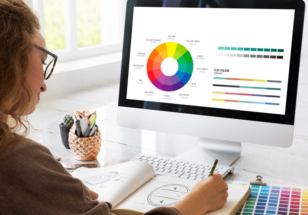
Color isn’t just a visual element; it plays a significant role in how users perceive your website or app and interact with it. The psychology of color can influence emotions, behaviors, and even purchasing decisions. When you’re crafting a digital experience—be it a site or an app—understanding how different colors affect user interaction is essential for maximizing conversions.
The Basics of Color Psychology
Color psychology is the study of how colors influence human behavior and emotions. Different colors evoke different feelings, which can impact how users respond to your website or app interface.
- Blue often conveys trust and security, making it a popular choice for banks, financial institutions, and fintech apps.
- Red is associated with urgency and excitement, which can encourage quick action—useful in eCommerce websites as well as food delivery apps.
Choosing the Right Colors for Your Brand
Your brand identity should guide your color choices across both web and app design.
- A luxury brand might opt for darker hues like black or deep purple to convey sophistication in its site and mobile app UI.
- A health-focused brand might use greens and blues to evoke feelings of calmness and reliability, ensuring consistency across its website and wellness apps.

Quick Guide to Color Associations:
- Red: Passion, urgency, excitement
- Blue: Trust, security, calm
- Green: Health, tranquility, growth
- Yellow: Optimism, energy, attention-grabbing
- Purple: Luxury, creativity, sophistication
- Black: Elegance, power, authority
- White: Simplicity, purity, cleanliness
Color Combinations and Their Impact
It’s not just about individual colors; how colors work together can be equally important in both websites and mobile apps.
- Complementary colors create vibrancy, while analogous colors provide harmony.
- An organic product store may use green and brown in its website and app for natural vibes.
- A tech company may choose blue and gray across its SaaS site and mobile app for professionalism and innovation.
Testing various combinations on both platforms helps discover what resonates with users.
The Role of Color in Calls to Action (CTAs)
CTAs are crucial for conversions across web and app interfaces. The right color can make your button stand out and encourage action.
- A contrasting color for “Buy Now” on a website or a “Subscribe” button in an app boosts clicks
- Studies show bright colors like orange or green improve CTA performance across digital products.

Testing and Analyzing Color Choices
Whether it’s a website landing page or an app home screen, testing color impact is vital.
- Use A/B testing to compare different CTA colors or theme variations.
- Track metrics like click-through rates, bounce rates, conversion rates, and session duration across both platforms.
Staying Consistent Across Platforms
Consistency is key in branding. Once you’ve established a color palette, carry it across websites, apps, social media, email marketing, and even offline materials.
- If your app uses a specific shade of blue, your website and marketing channels should mirror it.
- This reinforces your identity and builds trust with users.
Getting Started with Color Psychology in Digital Design
If you’re ready to harness the power of color psychology, define your brand identity and the emotions you want to evoke. From there:
- Choose a palette that works well for both web and app design.
- Test and refine based on audience response.
- Analyze data to optimize conversions.
Color choices have a direct influence on how audiences interact with your digital products. Make them count — and watch your website and app conversions grow.
With The Web People, you have access to a team of experienced graphic designers and UI/UX specialists who are dedicated to understanding the unique DNA of your brand. They craft a visual identity that resonates with your core values and business goals.
Our designers will work with you to choose the perfect color palette, typography, and theme that not only looks great but also communicates your brand’s message effectively. This thoughtful and strategic approach ensures your brand stands out, connects with your audience, and is set up for long-term growth and success.

