When you think about web design, the first elements that might come to mind are images, colors, and layout. But typography plays a crucial role that can’t be overlooked. It’s the art of arranging text to make it legible, readable, and visually appealing. The right typography can enhance user experience, guide the viewer’s eye, and convey the brand’s personality. If you’re diving into web design, understanding typography is essential. Let’s break down the role it plays and some tips to get it right.
Why Typography Matters
Typography isn’t just about choosing a font. It’s about creating a visual hierarchy that helps users navigate your site. Good typography can:
- Improve Readability: Clear fonts make content easier to digest.
- Establish Brand Identity: Fonts can convey emotions and personality, helping to set the tone for your brand.
- Enhance Usability: Well-structured text guides users through the information they need.
- Influence Engagement: Attractive typography can keep visitors on your site longer and encourage them to take action.
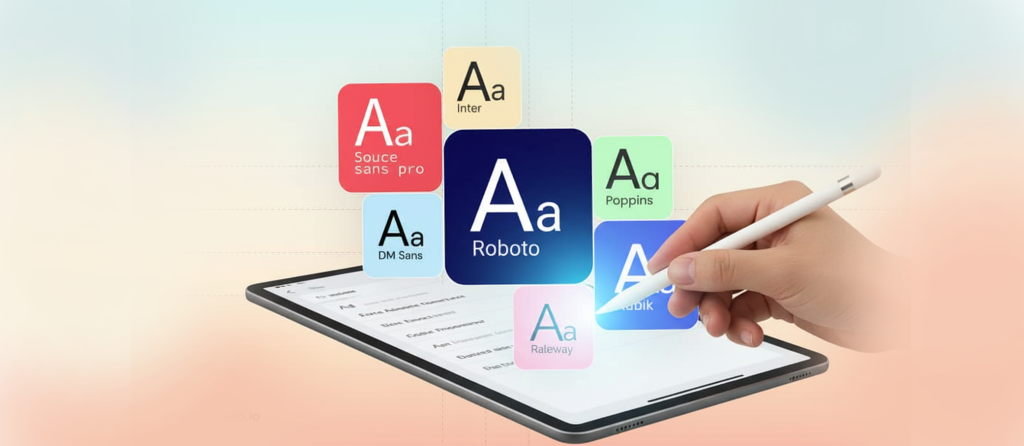
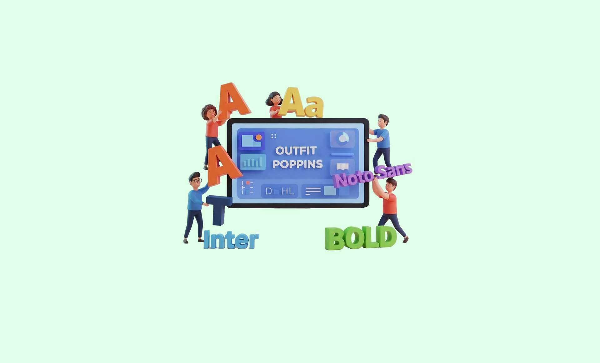
Choosing the Right Fonts
When selecting fonts for your web design, consider these factors:
- Readability: Always prioritize fonts that are easy to read on screens. Avoid overly decorative fonts for body text.
- Contrast: Ensure there’s enough contrast between your text and background. Dark text on a light background usually works best, but the opposite can also be effective.
- Brand Alignment: Choose fonts that reflect your brand’s personality. A tech startup might opt for modern sans-serif fonts, while a vintage shop might go for serif fonts with a classic touch.
- Web-Safe Fonts: Stick to fonts that are widely available across different browsers and devices. Google Fonts is a great resource for free, web-friendly options.
Font Pairing Strategies
Pairing fonts can be tricky, but it’s an art that, when done right, can bring your design to life. Here are some tips:
- Mix Styles: Pair a serif font with a sans-serif font. This creates contrast and interest. For example, you might use a serif font for headings and a sans-serif for body text.
- Limit Choices: Stick to two or three fonts. Overloading your design with too many fonts can make it chaotic and difficult to read.
- Consider Hierarchy: Differentiate headings, subheadings, and body text with variations in size and weight. This helps guide readers through your content.
- Test Combinations: Experiment with different combinations and see how they work together. Sometimes, what looks good in theory might not work in practice.
Effective Use of Font Size and Weight
Font size and weight can significantly impact how your text is perceived. Here are some best practices:
- Hierarchy: Use larger sizes for headings and smaller sizes for body text. A common practice is using 16px for body text, while headings can range from 24px to 36px, depending on the design.
- Weight Variations: Use bold for emphasis, especially for headings or important points. This helps draw attention where it’s needed most.
- Responsive Design: Make sure your typography scales well on different devices. Test your site on mobile, tablet, and desktop to ensure readability across all platforms.
Whitespace Is Your Friend
Whitespace, or negative space, is crucial in web design. It helps prevent your design from feeling cluttered and allows your typography to breathe. Here’s how to make the most of it:
- Spacing: Use adequate line spacing (leading) and letter spacing (tracking) to enhance readability. A good rule of thumb is 1.5 times the font size for line spacing.
- Margins and Padding: Ensure there’s enough space around your text and other design elements. This separation helps users focus on one element at a time.
- Break Up Text: Use paragraphs, lists, and headings to break up large blocks of text. This makes it easier for readers to skim and find what they’re looking for.

Testing Your Typography Choices
No design is complete without testing. Gathering feedback can provide invaluable insights. Here are some methods to evaluate your typography:
- A/B Testing: Test different font choices or sizes on your audience to see which performs better in terms of engagement and readability.
- User Feedback: Ask real users for their opinions on your typography. They might offer insights you hadn’t considered.
- Analytics: Monitor how users interact with your text. Are they reading through to the end? Are they clicking on calls to action? This data can guide future typography decisions.
Getting Creative with Typography
While best practices are essential, don’t be afraid to get creative. Typography can also be a form of art. Think about:
- Custom Fonts: If your brand allows it, consider commissioning a custom font that reflects your identity.
- Dynamic Typography: Experiment with animated text or interactive typography to engage users in unique ways.
- Contrast and Color: Play with different colors and contrasts to make specific text pop. Just remember to maintain readability.
Putting It All Together
Typography is a powerful tool in web design that can make or break a user’s experience. By understanding its role and applying these best practices, you can create a visually appealing and functional website. Take the time to select the right fonts, pair them wisely, and ensure readability. Don’t forget to test your choices and be open to feedback. With thoughtful typography, you can enhance your web design and create a lasting impact on your audience.